OM
FOOTBALL UNFILTERED.
OM turns raw intensity into a brand.


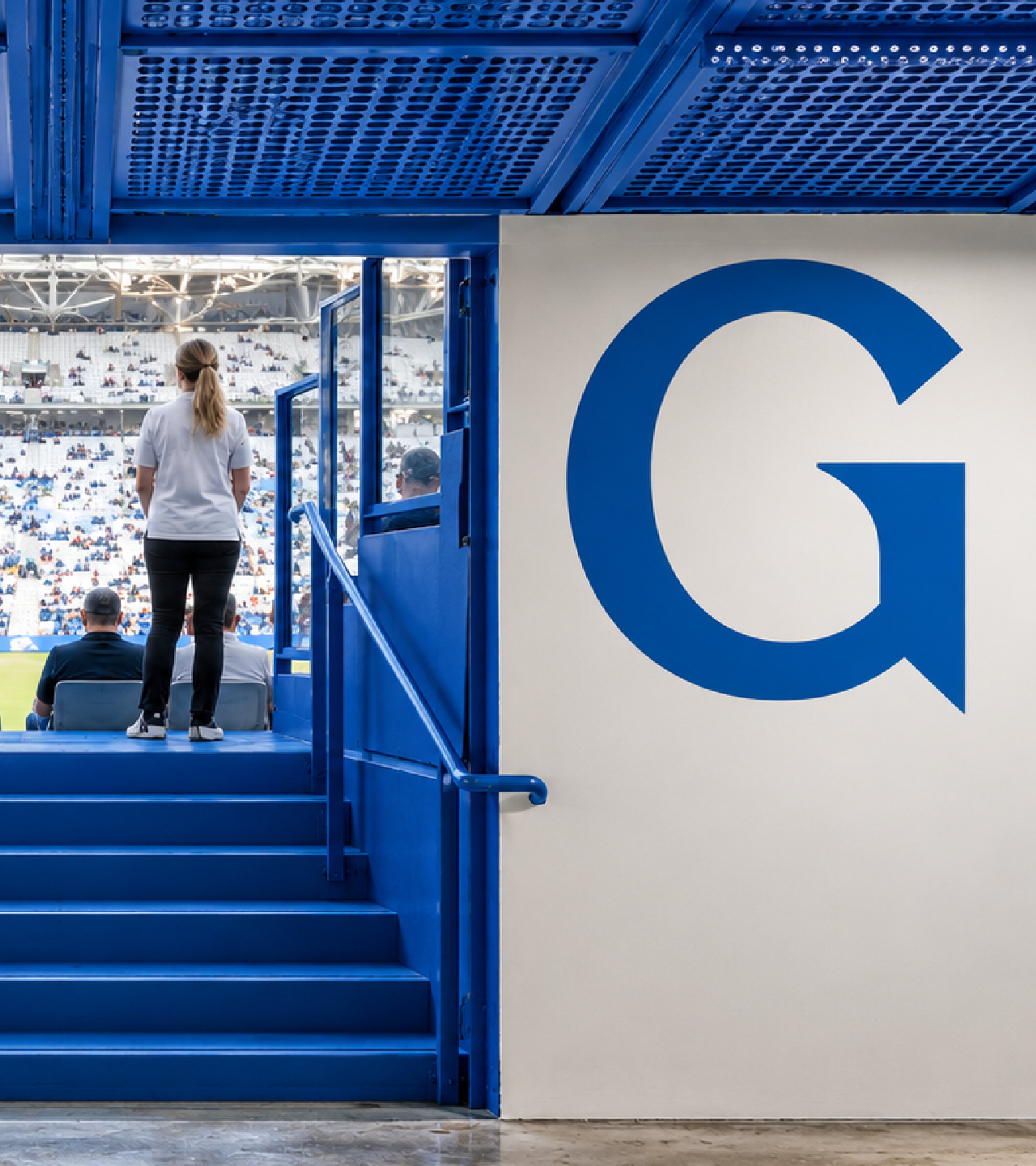
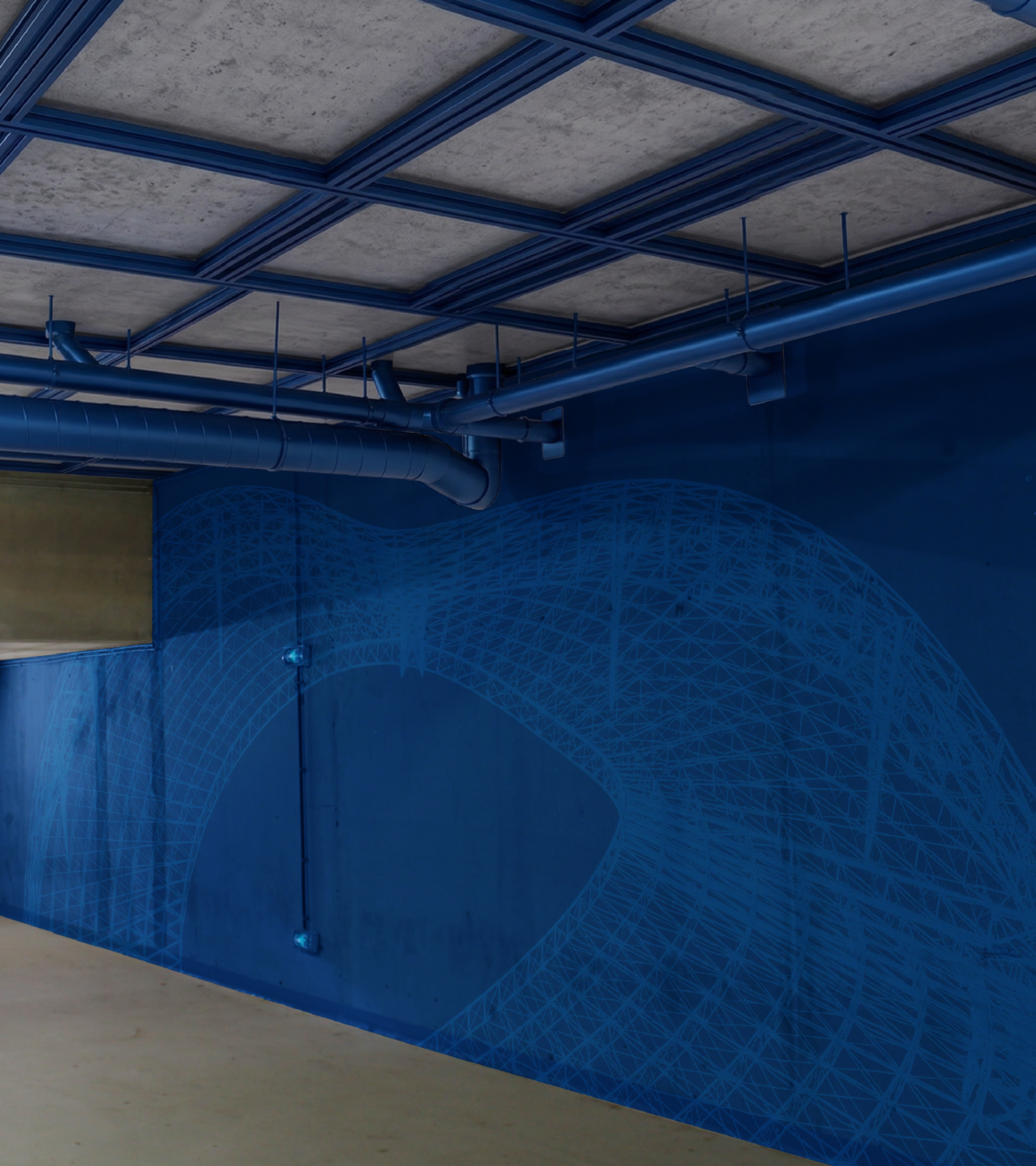

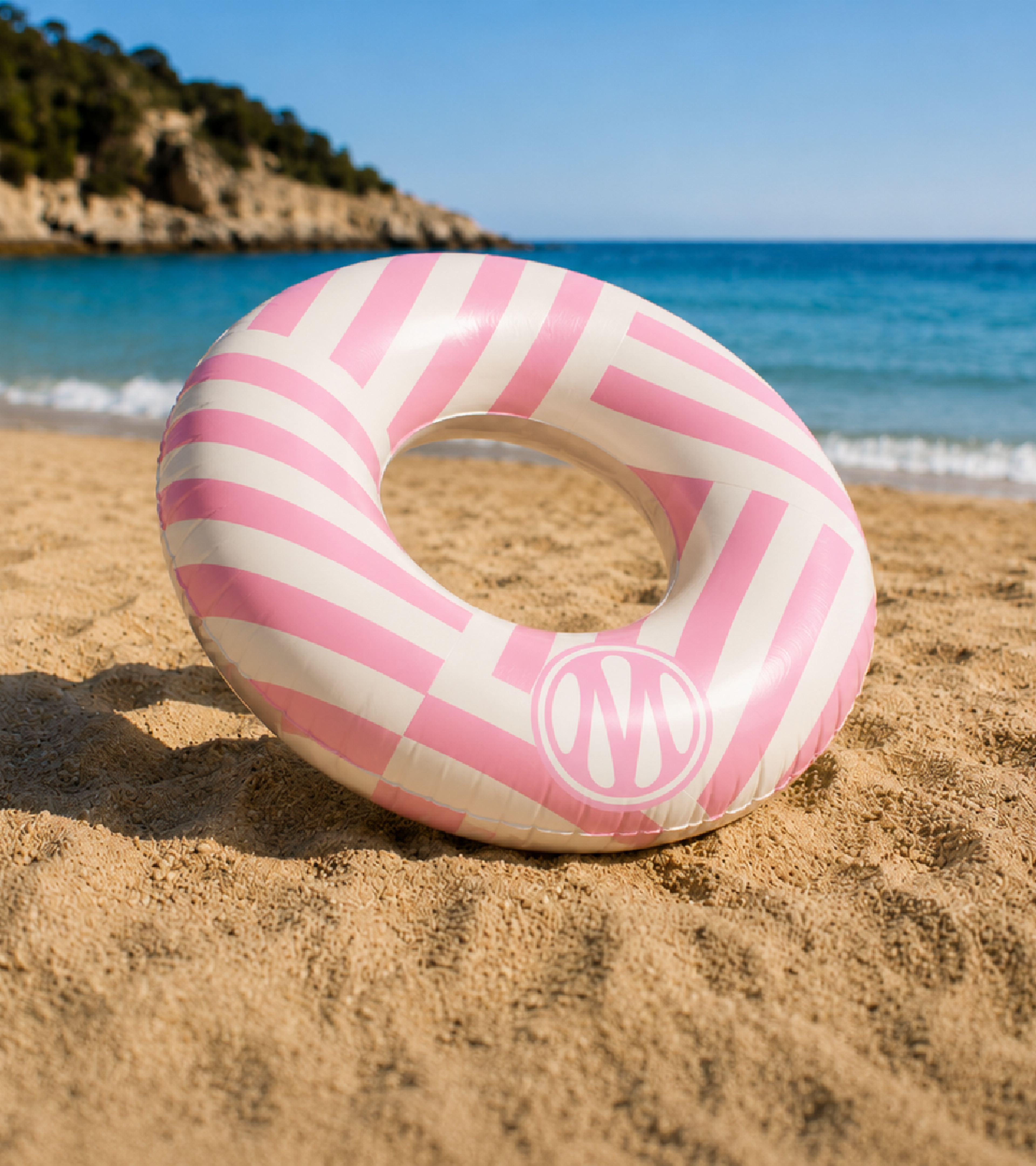
- BRAND
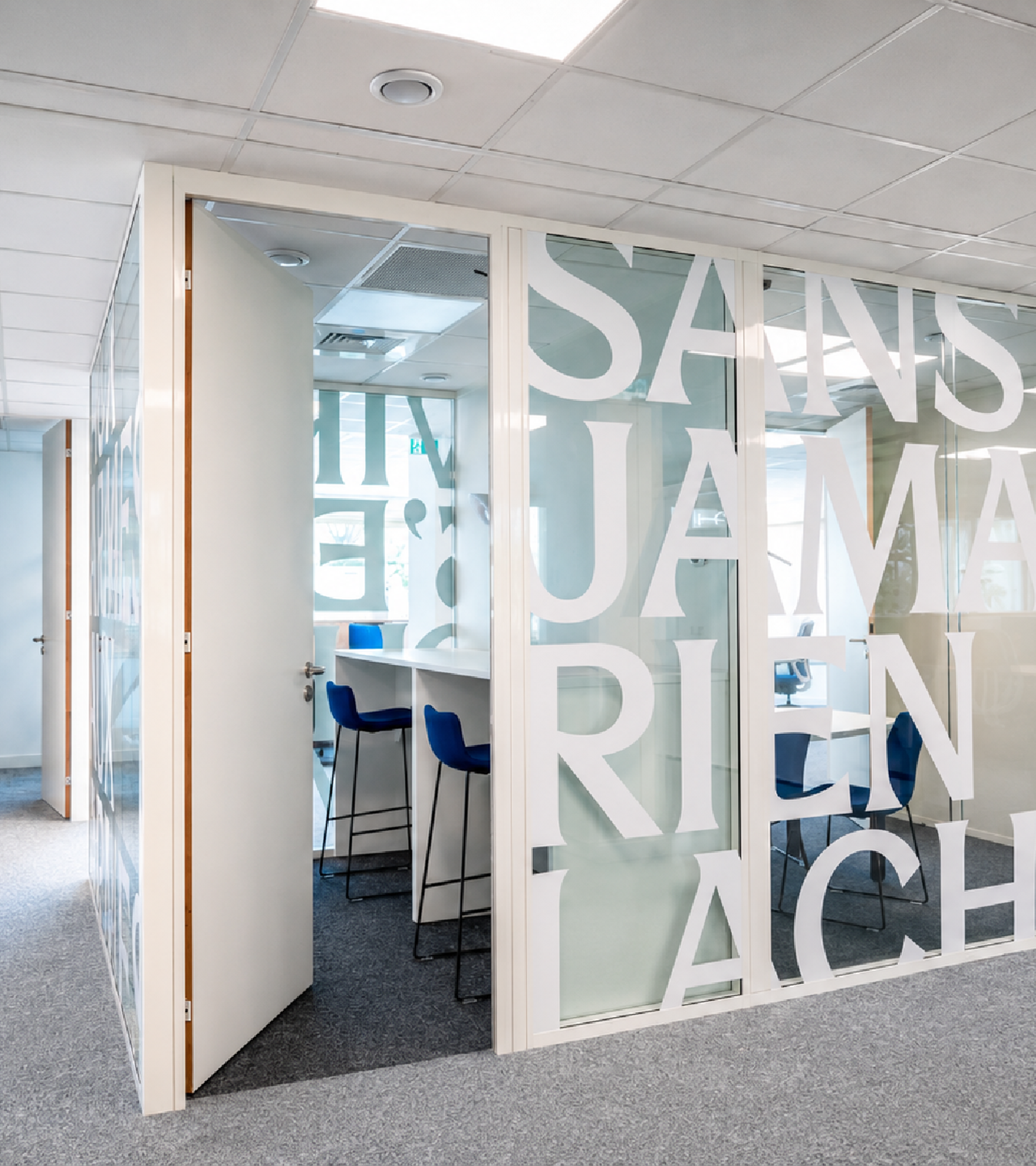
- Brand strategy Brand architecture Custom typeface Visual territory
- EXPERIENCE
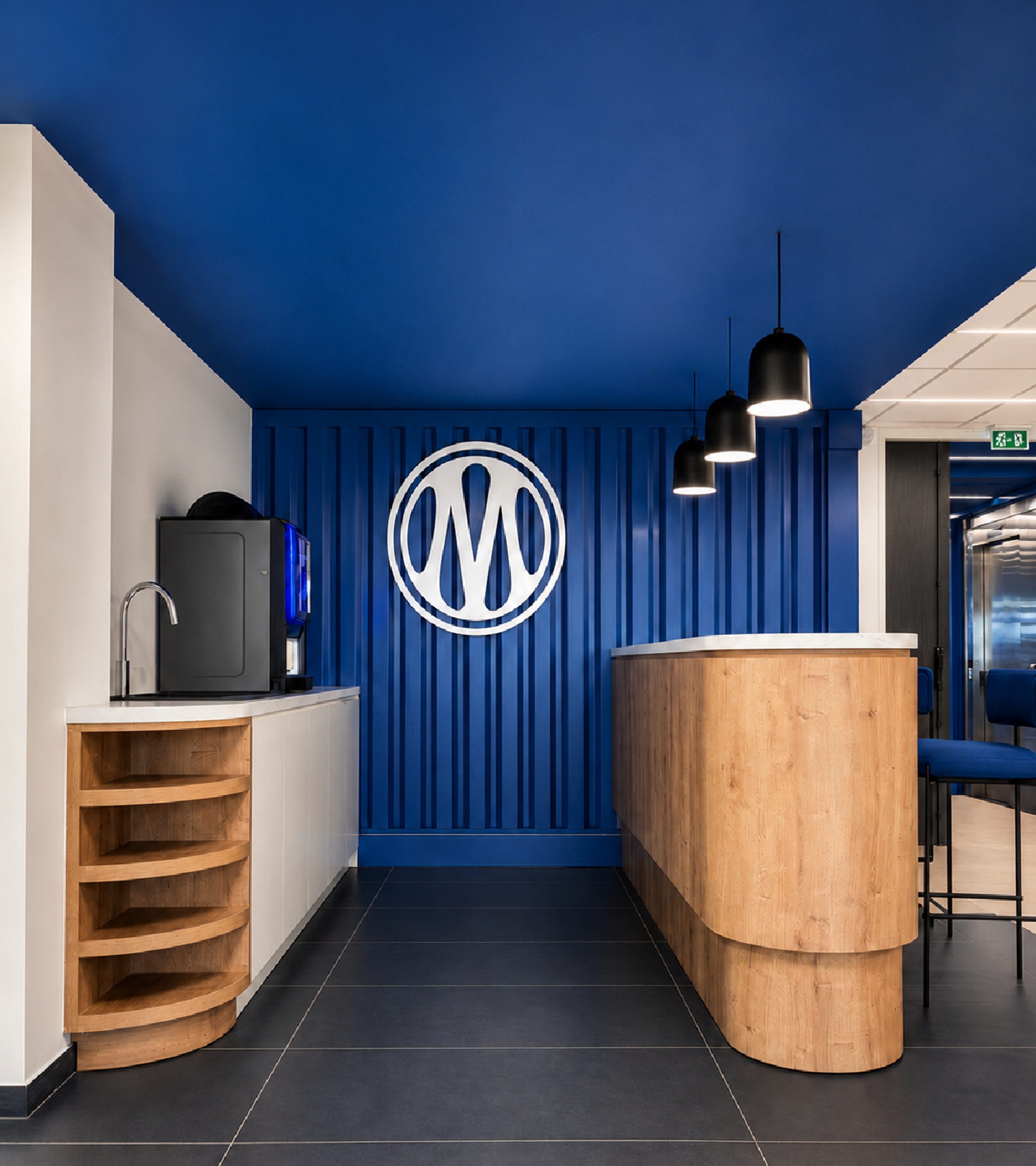
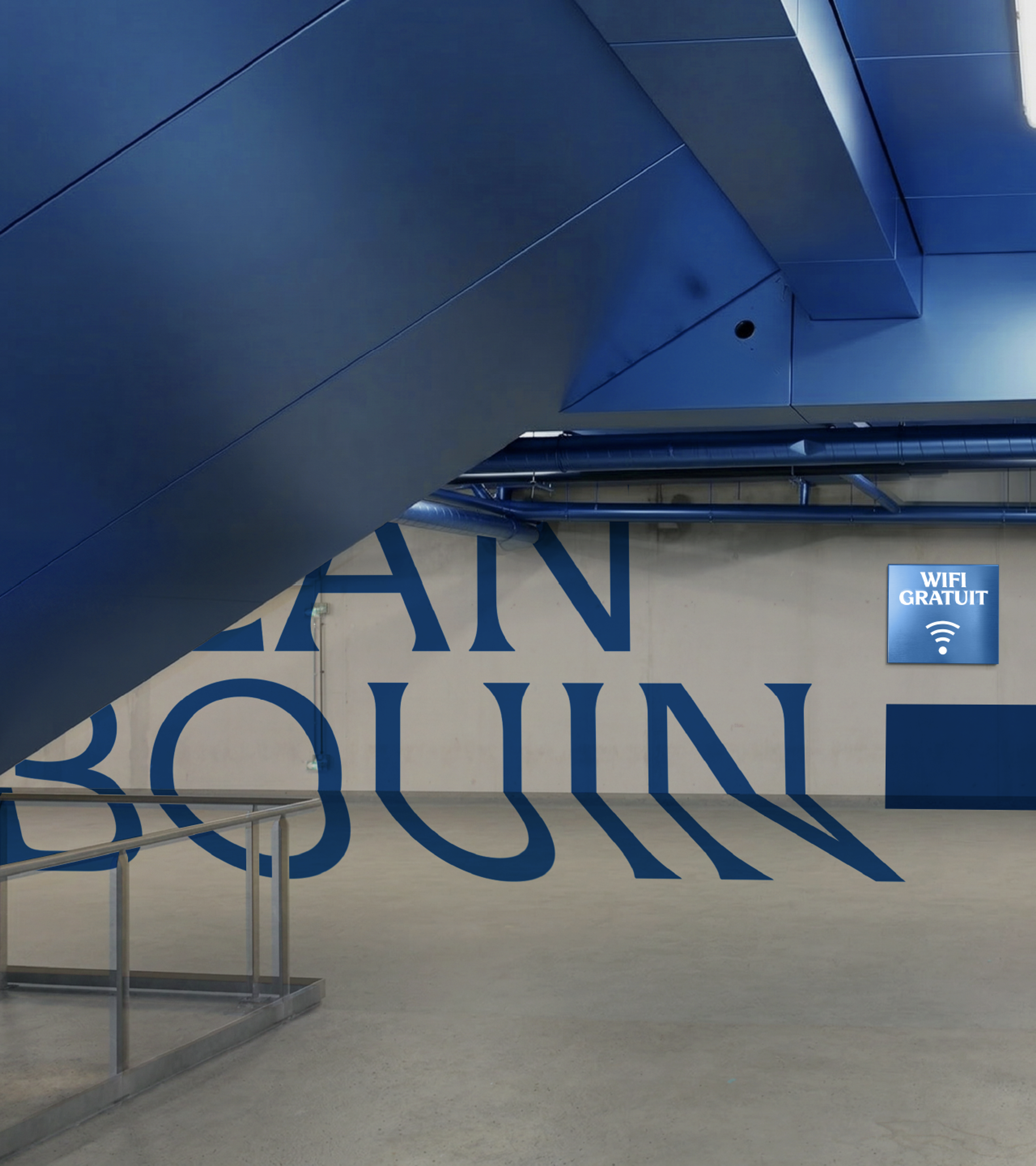
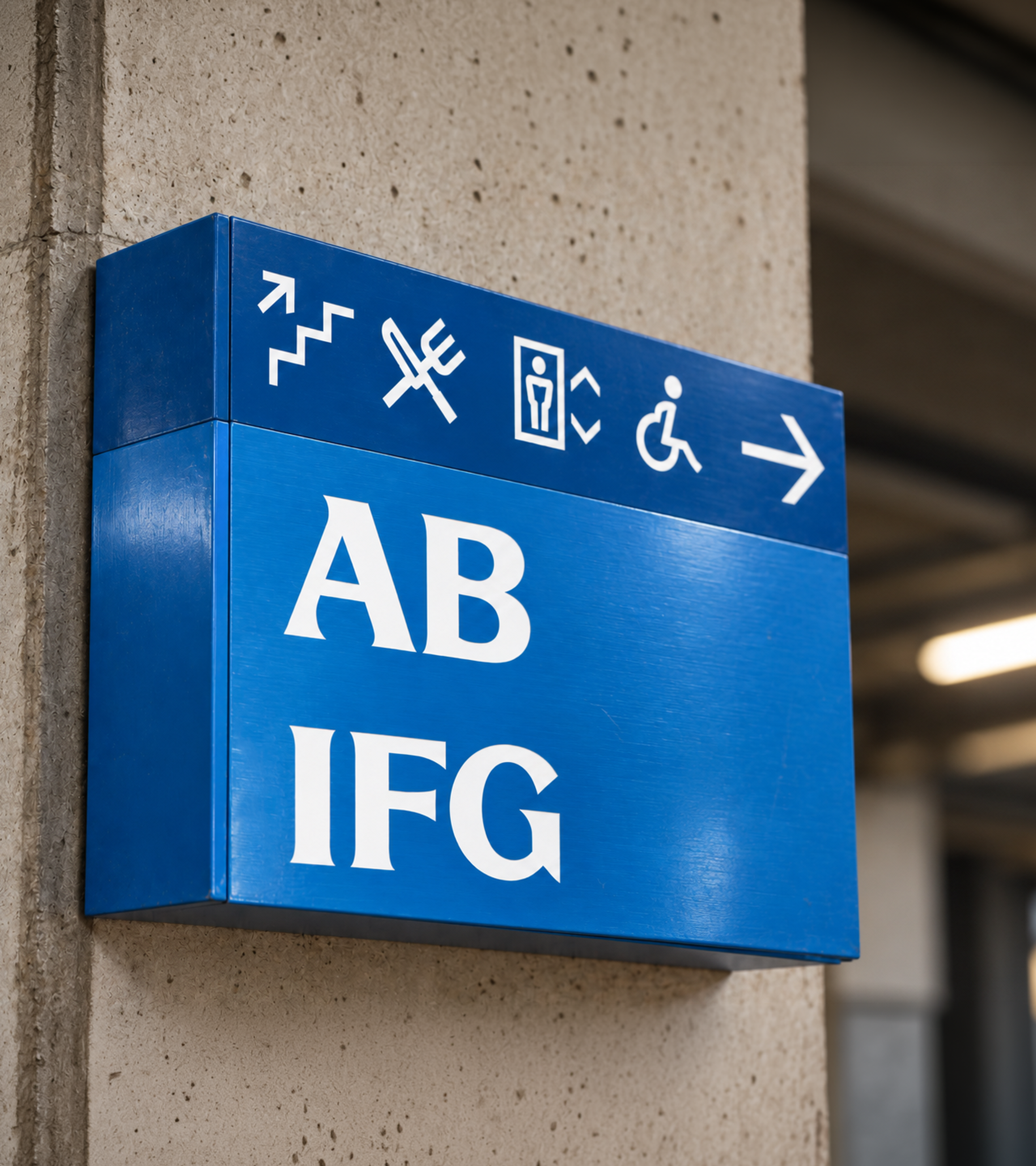
- Stadium branding & wayfinding Space design (headquarters & training centre) Motion design Merchandising & licensing
- DIGITAL2026
- Web design UX / UI Social media Brand launch website
Olympique de Marseille is an exception. Football here is lived with singular intensity: in the stands, across the city, far beyond the pitch. The brief: evolve OM without losing its soul, and turn the authenticity of a club woven into the people of Marseille into a brand that carries across the world.
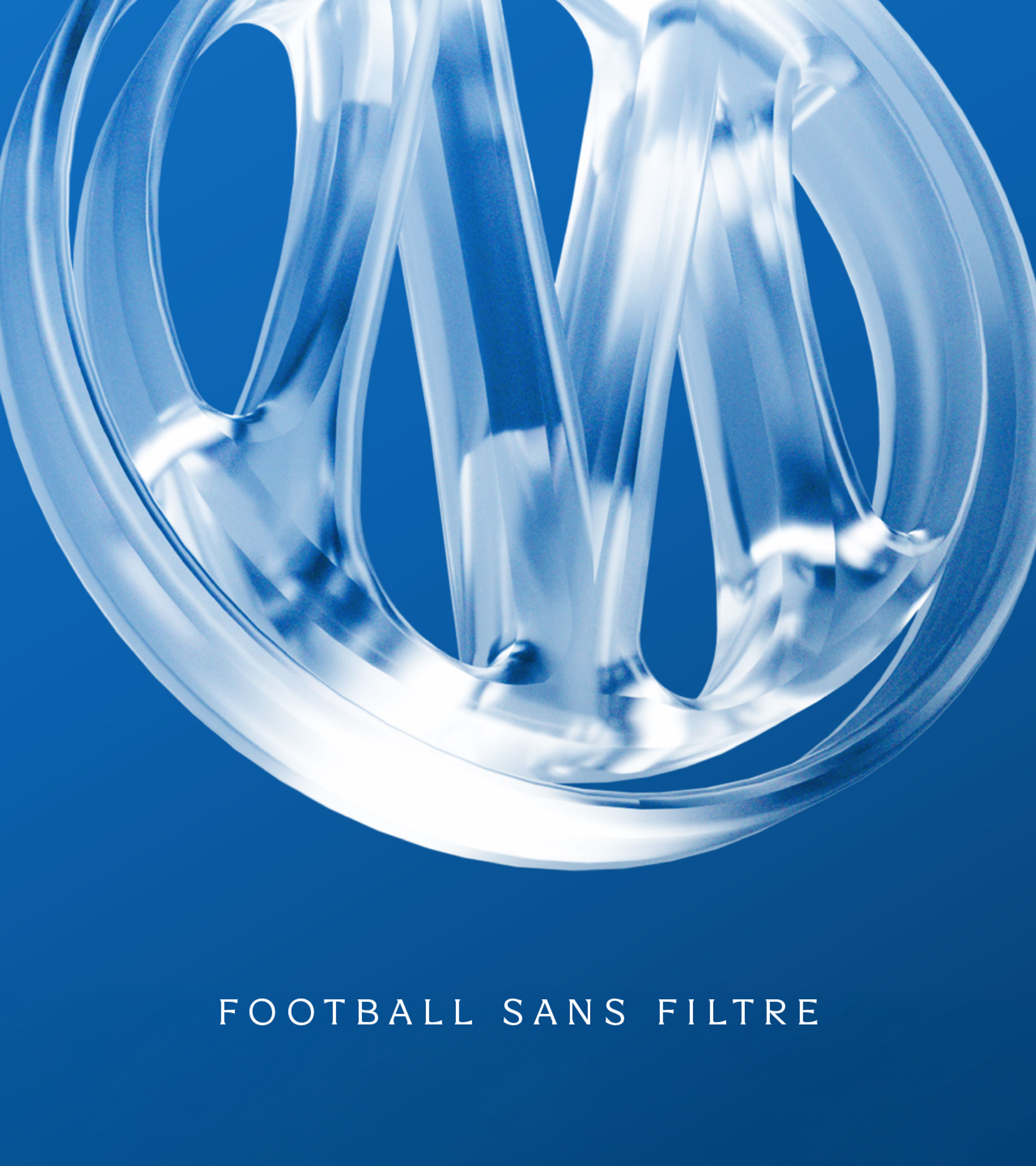
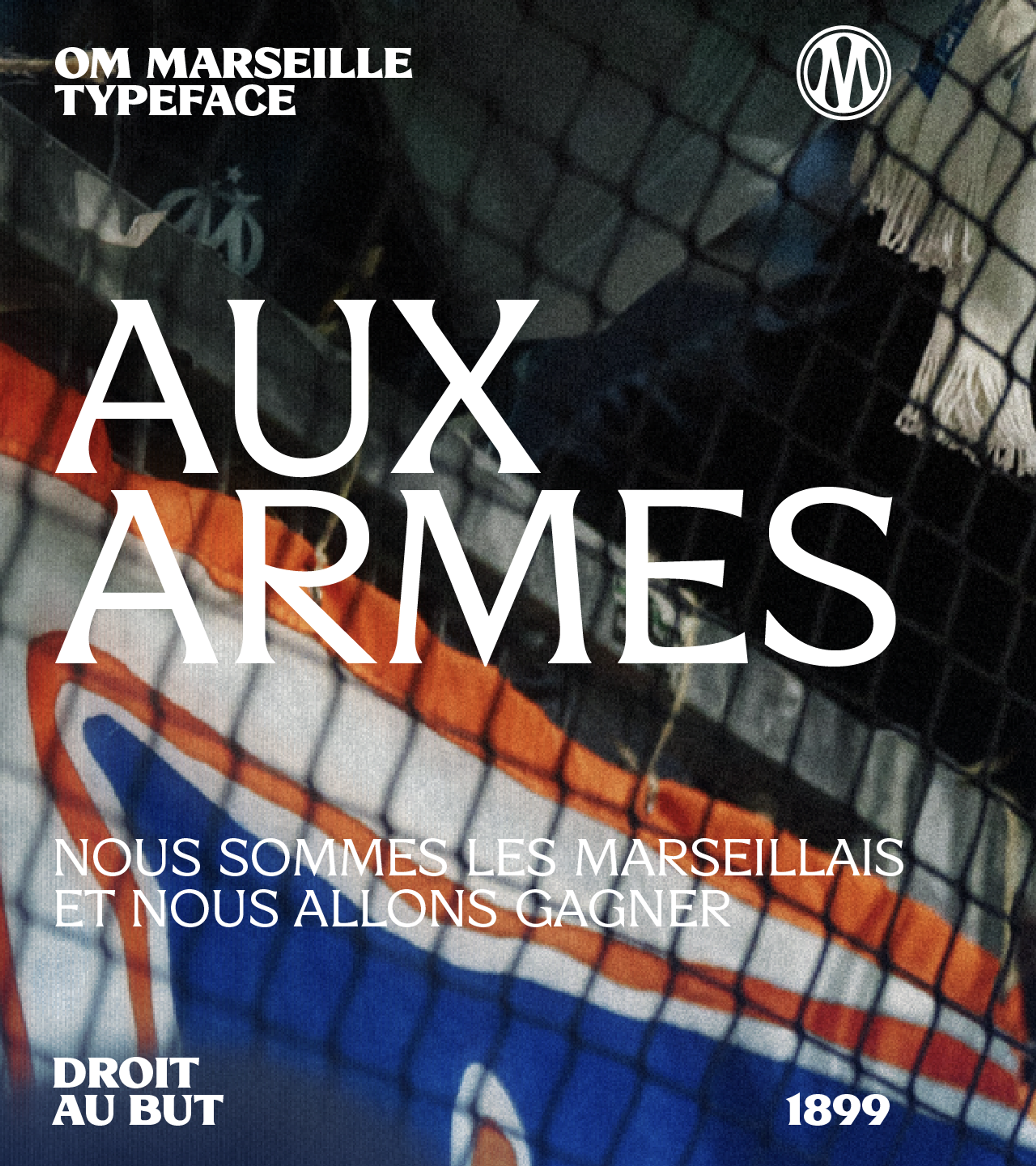
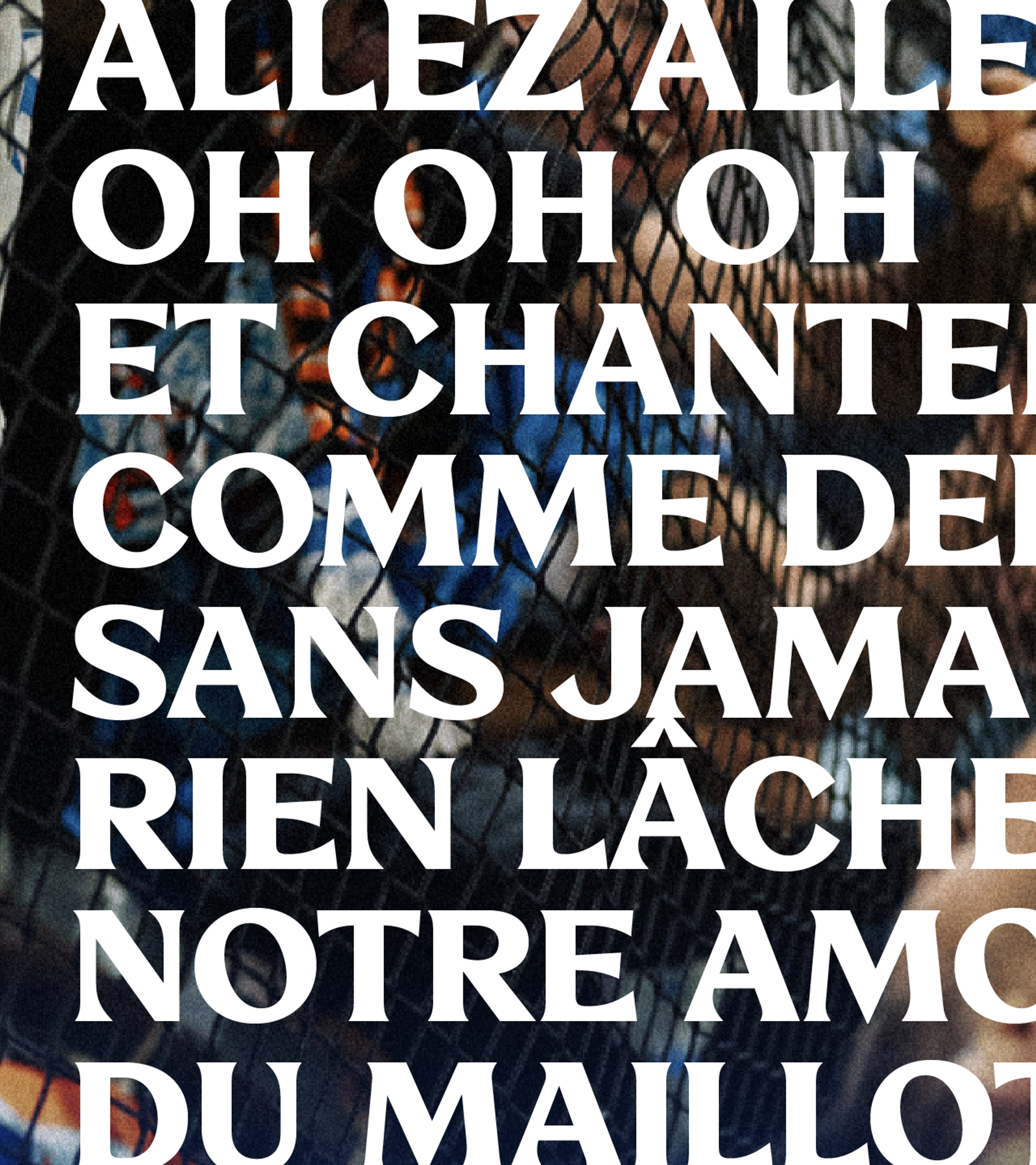
"UNFILTERED FOOTBALL" becomes the brand's central idea, drawn straight from Marseille, where emotion, voice, fervour, and pride go unfiltered. Starting from the new logo and colours created by OM's own teams, we built a complete brand language, unfiltered down to the design. A Mediterranean palette of the new Marseille Blue, Deep Sea, white, and a final note of gold. A proprietary OM Marseille typeface, bold and geometric with subtle serifs inspired by the Mediterranean way of life. Three levels of photographic treatment, from natural to stylised, and fervour patterns that turn crowd photography into organic texture.
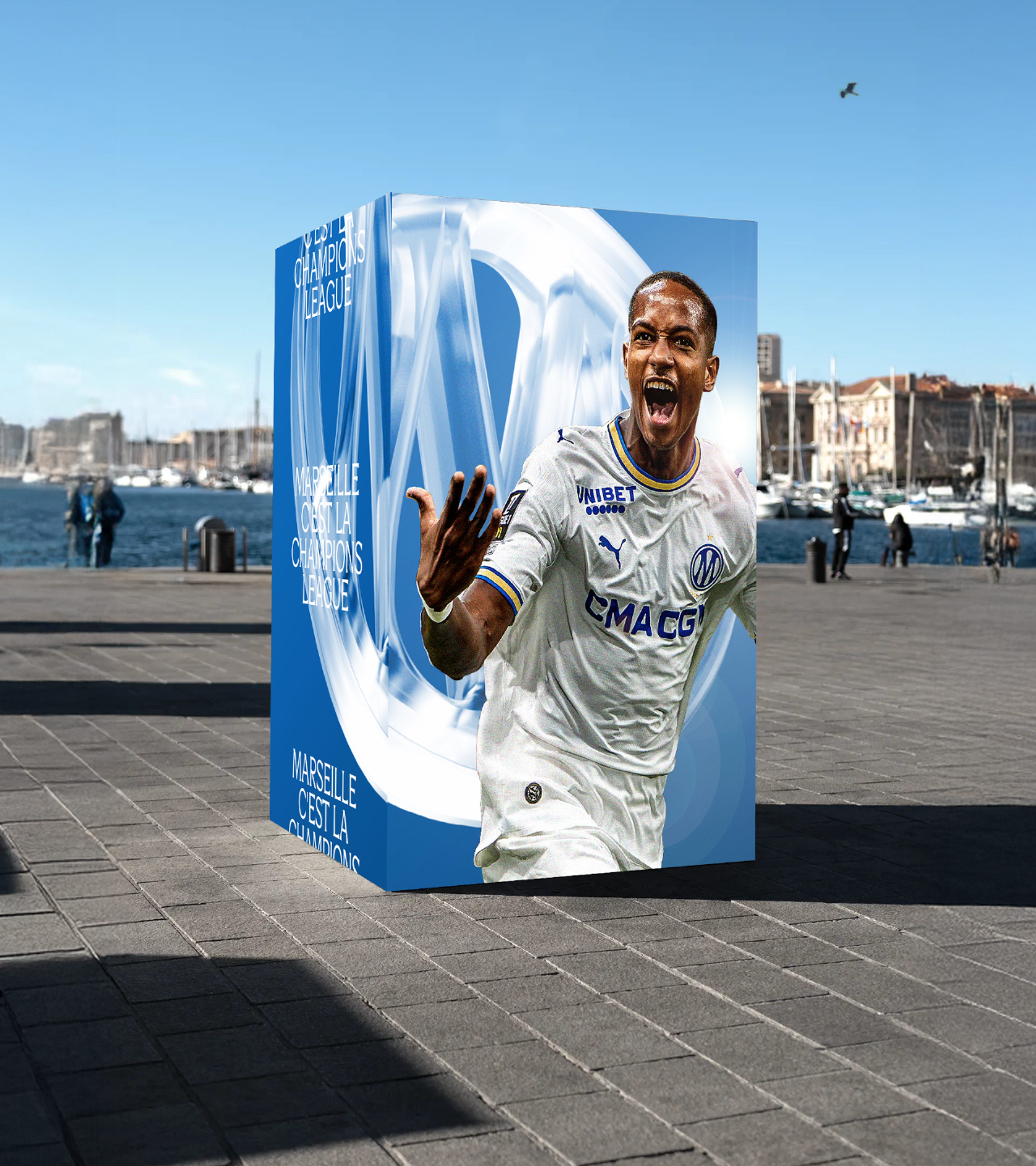
One system spans the team, stadium, digital, club spaces, merchandising, and employer brand, giving OM a single voice with all its intensity intact. The result: a brand universe that doesn't filter OM's identity. It amplifies it.